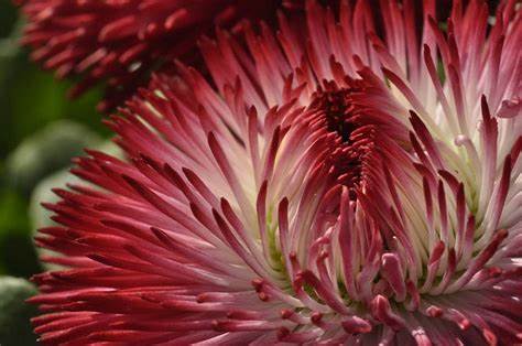
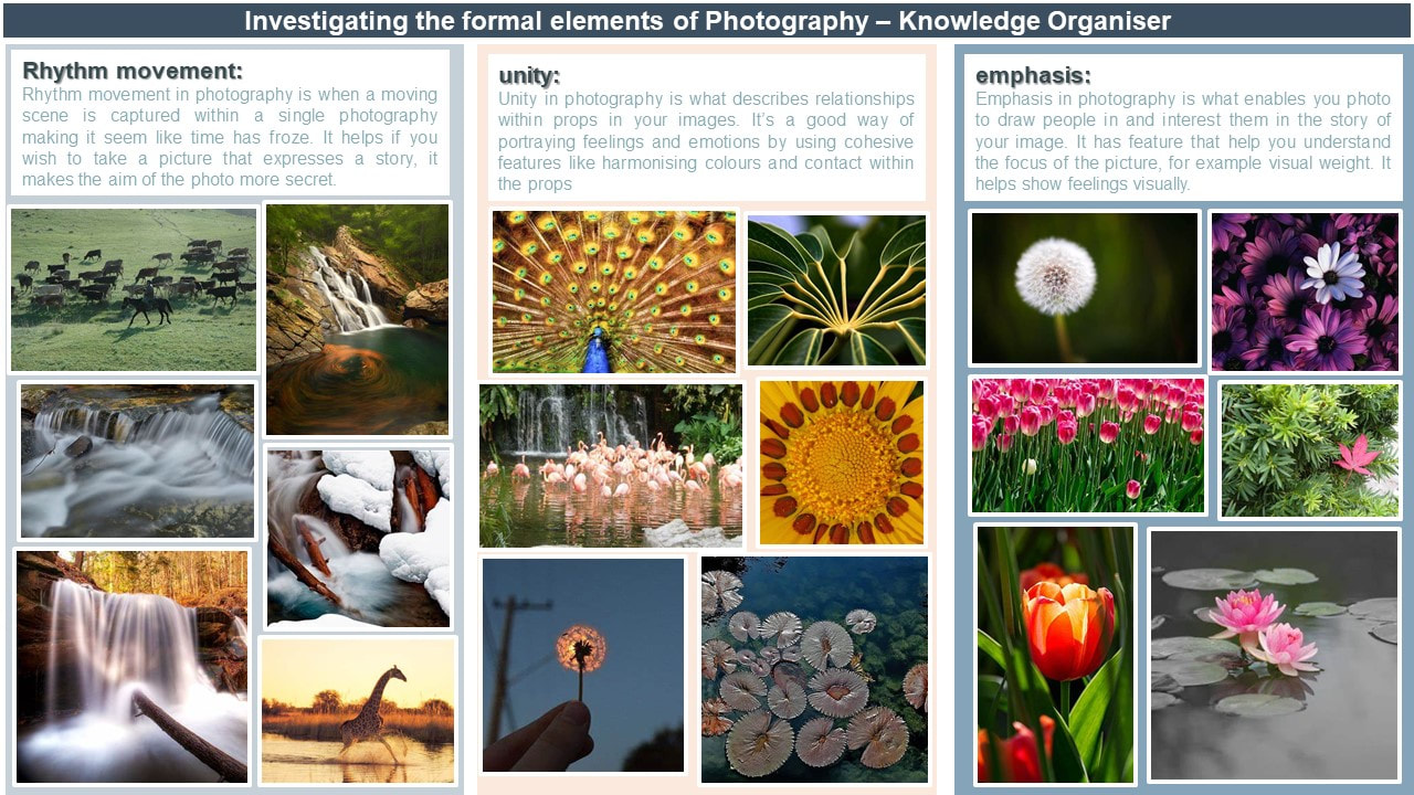
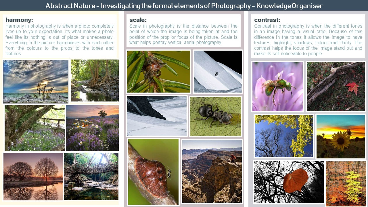
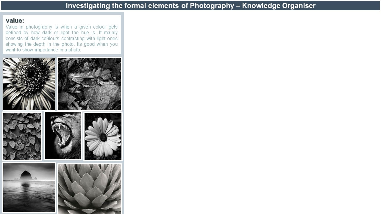
Abstract nature: Personal Project 1

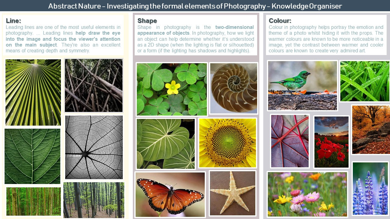
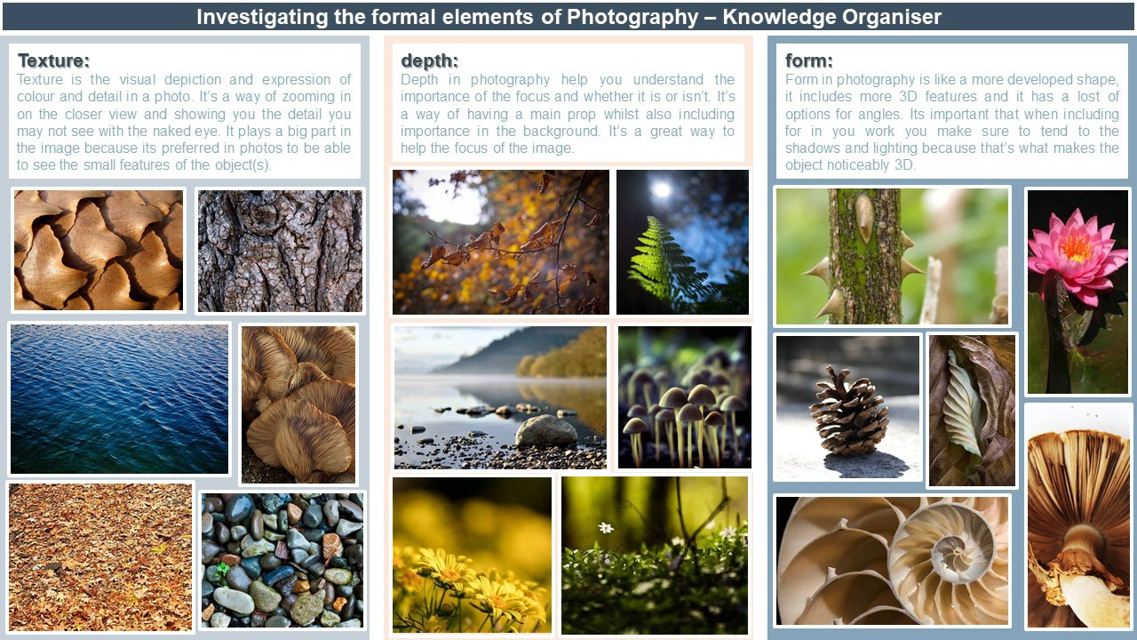
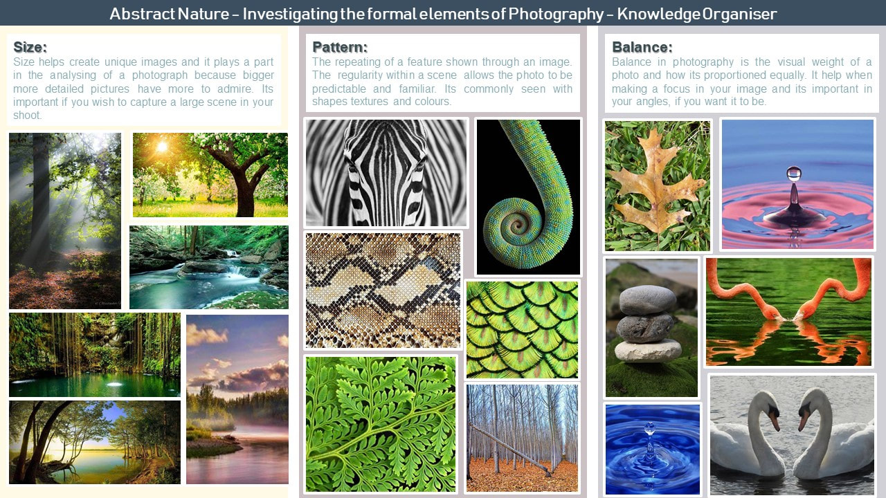
Abstract Nature: what is abstraction?
Abstract photography is when you take pictures of different variety, these different varieties could include different angles, colours, framing, focuses and filters. Its when a photo has a different take on a focus, seeing it from another set of eyes .It works on the different principles of design and elements of art incorporating them into the photos. There are also many processes of taking photos to keep in mind when talking about abstract photography, there's shutter speed, aperture priority and depth of field. Below is my investigation into the formal elements of photography with research and chosen images to accompany it.
|
|
|
|
|
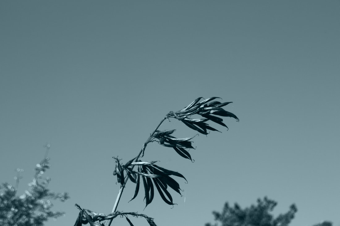
Abstract Nature: INVESTIGATION OF ABSTRACT PHOTOGRAPHY TECHNIQUES / monochromatic.
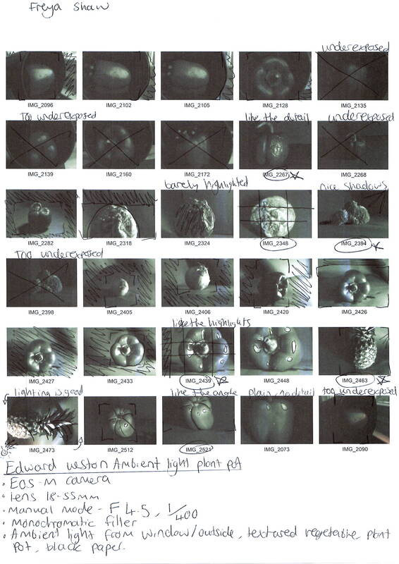
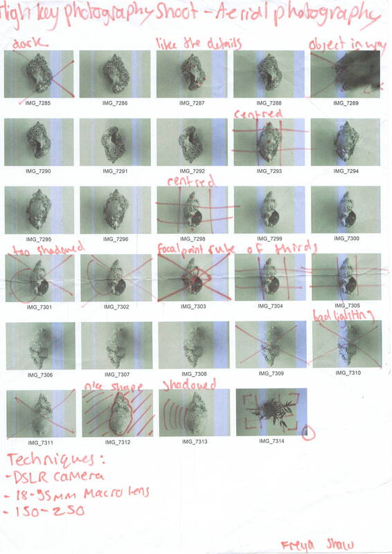
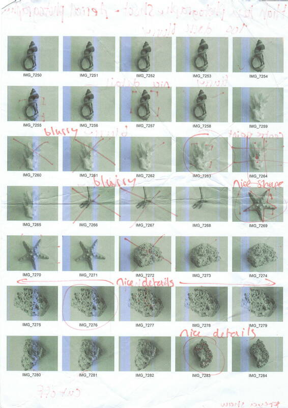
CONTACT SHEET:


In this shoot I used multiple techniques and equipment, this includes the camera I used which is a canon EOS M and the lens which is a macro 18-55m. I used the features of aperture priority on the camera and a monochrome filter set as the style. I also changed the shallow depth of field to f/3.7 . all these aspects affected the overall result of this shoot.
During this shoot I used my EOS m camera with my 18-55mm macro lens to get my results. I also used the monochrome setting and a aperture of 4.5/f this created the blurred effects that are visible. The environment really affected the pictures because the natural sunlight lit up the pictures and helped them even though there wasn't any colour, also there was minimum wind making the process of taking the pictures easier. I also recognised the variety of angles I was able to use and how some photos were taken from a lower angle whereas others higher angle, there was also usage or the angle eye level. Overall, I think I used a lot of affective techniques.
My strength during this shoot I imagine are the way I was able to frame the photos well and use the aperture priority to get a nice blur in the image, I liked using the monochrome filter as well because of the effect it took on the picture and how it completely changes the mood of it. my limitations during this photoshoot would be how during the actual process of taking the photos I was having trouble keeping my arms still and focusing the image in the way I wanted it, I also found the shutter speed hard to work.


Best Images

|
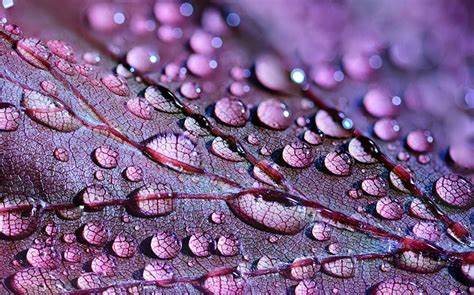
This image was chosen because of its lighting and how the light is angles onto the leaf making a nice smooth shine. I also liked the background and how you can see some of it whilst the rest is zoned out. The editing done to this picture was me changing the temperature and tint to -18 and 11 creating a nice turquoise hint to it. I liked the colour added because it was very controlled and didn't go out of hand and become something bright and in your face. I also changed the brightness to the image giving the detail more acknowledgment and also to make the background blur more visible and not a void type of blur. I di do a slight crop to the photo just to focus more on the leaf than the background since it was taking up most of the picture.
|
|
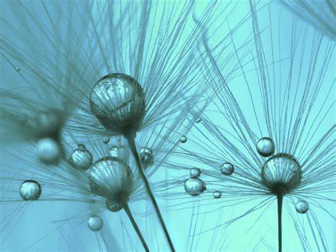
I liked this picture because of the colour hue I added to it and the birds eye view angle that I took the image at. I like how the closer part of the plant is blurred to make a focus point on the background part. other than the tempera and tint I added to it to get a cool affect I also brightened up the image so that more of the finer details like the textures on the different objects could be seen. I also decided to sharpen the image because I liked how it made the picture feel like a professional photo'd image. I finally decided to crop the image because if you see the original the screen contains more leaves and hasn't got a type of focus, cropping it allowed there to be more of a defined point and also the image not cropped would clash with the sharpness because the details were to small to focus on.
|
|
I edited this picture using the temperature and tint feature to give the same effect as the others, it having a cool tone. I had to choose between brightening the picture or darkening it and in the end I decided it looked more appropriate with the cool tone added. I also had to decide whether to crop the photo or not and I decided against it in the end because I thought that the empty space in the background gave a singled out type of effect and it also helped make a obvious focus in the photo. I added a small sharpen to the mage just to clear the edges out on the main plant in the centre.
|
|
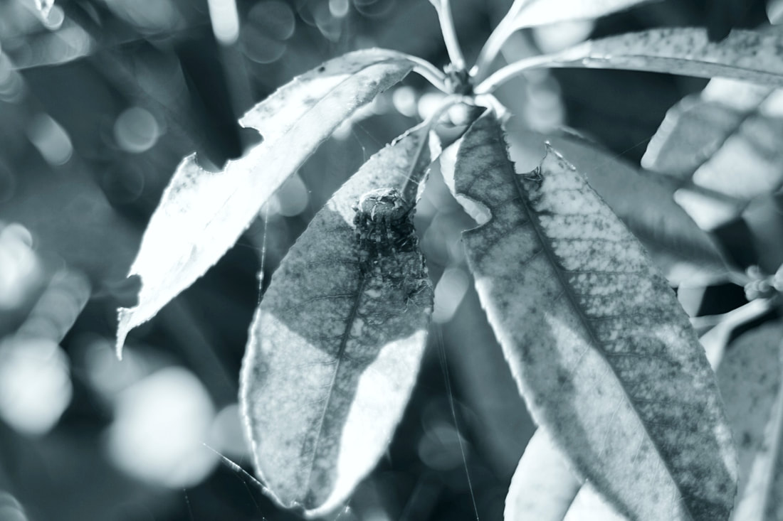
In this picture I added the same colour tint as he others to keep to the cool theme and I also brightened up the image a decent amount, this revealed the cobweb and the spider that I wanted to be the main focus. I really liked the way you can see the cobweb in the image and decided it needed something else so I added auto pop which brought out every feature o a sharp and detailed version, like the leaves for example which had a very original pattern detail with different shades and lines going in multiple angles. I also experimented with the Background and made it have a more blurred effect so that there was defiantly nothing more important than the spider and the cobweb.
|
Abstract Nature: INVESTIGATION OF ABSTRACT / shallow depth of field


In this shoot I used a EOS M camera and a macro 18-55mm lens to take these photos. I used shutter mode to get the motion presented in the images and I also spun the camera around. I also swayed the camera from side to side, overall all thee features I used came together and created a variety of blurred motion pictures.
Whilst taking these photos I used my camera in different ways, for example I moved it in a circular motion and back and forth motions. I also experimented with other movements of the camera like moving the camera closer to or further away from the flowers. We were given a background that was plain white to place our objects on and we were using the natural light given.
My strengths during this shoot were portrayed through in my opinion the motions used. when actually taking the photos I had fun and really experimented with the camera and the organisation of the flowers provided. I had trouble when taking the photos because I would either go too fast with the movements making a flash of a photo or too slow making a slightly fuzzy photo.


Abstract Nature: INVESTIGATION OF ABSTRACT PHOTOGRAPHY TECHNIQUES / shallow depth of field.

|
|


In this shoot I used my EOS M camera with my macro 18-55mm lens to create these photos. I used aperture priority and a shallow depth of field measured at f/4.5 to create the blurred background you can see. These features all pulled together to create very unique mood. All the very simple plants used a props really turned into a admirable picture.
During this shoot I had to bear in mind the usage of my angles an the variety that could be used, I also took notice of the natural lighting and used that to my advantage. When actually taking the photos I actually positioned myself a good distance away and used my zoom to get a focus on the main point of the photo. When taking this shoot there was an occasional hiccup due to a sudden bust of wind but as seen it was worked around and my pictures still succeeded.
In this shoot I image my strengths are the fact I was able to use a variety of angles and framing, I really experimented during this shoot and it worked to my advantage. I did find it difficult at first to get the rhythm of focusing the photo but I ended up smoothening that issue out in the end and was able to take some nicely focused pictures.


Artist Investigation / Edward Weston
“When subject matter is forced to fit into preconceived patterns, there can be no freshness of vision. Following rules of composition can only lead to a tedious repetition of pictorial clichés.” – Edward Weston
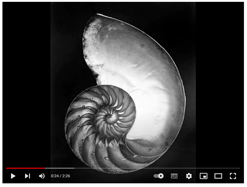
Why this video?
I chose this video because I like how it just plays a collage of multiple of Edward Weston's famous pieces, its telling the story of how his pictured evolved throughout time. it shows his creativeness and how he was able to find something interesting and beautiful in the most simplest of things like a shell. This is also proof that Edward Weston started a loved trend on low key images and its still to this day getting admired and appreciated. |
Why this artist?
In my investigation into abstract nature i will look at Edward Weston's work, his shoots are a prime example of abstraction and they also convey good principles and elements of photography like texture, shape and shadow. Who was he? Edward Weston is a photography born on the 24th of March in the year 1886. his work usually consisted of monochrome abstract shoots and he was one of the most innovative and influential American photographers at the time. He died on the 1st of January in the year 1958 ending his line of dramatic and focused shoots. Why the quote? I chose this quote because I like how he is encouraging odd and unusual ideas to be incorporated into your own work, he is giving a voice to his art and saying its creative to think different things are beautiful. he wants people to do different and experiment because just doing the same idea over and over again is stupid. |
SEMI Analysis / Edward Weston
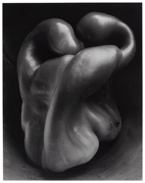

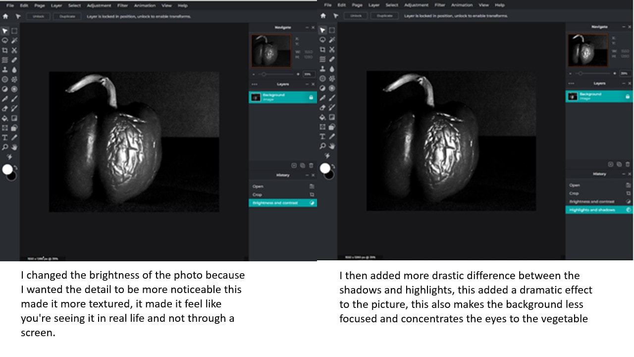
my interpretation of this photograph is that its trying to set a mood including possibly negative tones, the monochromatic filter which helps it get the attitude its conveying and the lighting which is eccentricating the monochrome feature are both making this image look depressing yet proud, the symmetrical framing is making it look smart in a simple way. I think this piece is trying to make as much of an impact as it can with something so simple as a pepper, the way the image is set out makes the deformity of the pepper almost unrecognisable because it doesn't seem like an importance in anything other than it being good prop. The image shown strong shape that's highlighted by the perfectly placed light and texture which is seen at the middle point between the highlights and shadows. It has a good usage of space, meaning there is little of it, and is sticking to the rule of thirds. The black and white filter in this example is what connects this to our theme since we have done a previous shoot including the same filter.
|

The photographer of this image is called Edward Weston and he created the photograph titled Pepper No.30 and it was taken in 1930 and was an unexpected favourite. The picture is a monochromatic version of the original green pepper, it has a good rule of thirds and an admired exposure illuminating the light and exaggerating the shadows. The whole monochrome feature of the photo helps bring out and define the shape of the deformed pepper and also displays the texture and indents.The genre of this photograph is abstract still life which was paired with a black and white choice of filter. The props I can see in this picture is a deformed green pepper in a simple set with simple lighting which all together formed a dramatic monochrome photo.
Edward west has a trend of taking very equal images with a ideal rule of thirds, if you were to draw the grid on this picture then a piece of the pepper would be showing in each of the nine boxes. The image was taken at was seems to be eye level which also helped with the evenness of the photo. this view that Edward chose makes the chosen prop fell more human like, this contributing to the shape of the pepper used can possible trick your mind at fist glance to make u see potentially a person. the image contains a lot of ideal features like texture shape and arguably space, these all help build the photo to a strong and memorable piece, which is what it ended up amounting to. the texture in the photography is clearly seen nearer to the outside on the highlighting parts, they aren't so dark or so like that u cant see it but its perfectly in-between revealing the simple indents and marks on it. The picture has seemed to of been taken from a close position to fill up the fame of the photo gain referencing the rule of thirds. I imagine artificial lighting was used because the light seems strong coming from the top of the image, this created drastic shadow that ad depth to the picture. the light being positioned this was also highlights certain aspects of the image, like the top of the pepper were the most deformed part is located. the atmosphere is affected by the lighting because it makes it feel more eerie but sharp looking, the monochromatic filter added on doesn't affect the lights power to make a picture feel as it dose. when I emulate Edward Weston's work I will need to use a the shutter speed and IOS to create a shard detailed and perfectly shadowed image, I will use artificial light so I can really position the highlights how I want and I will use a sort of background so the vegetable is the only focus in the image. |
Technical processes / low key photography

|
Low key photography is when a photo has a clear visible shadow as a background that helps to define the main focus of the image and make the detail feel more valuable, it adds a big dramatic affect to images and is a hard to do type of technique. Its really loved because of its high quality and because of the edge it gives a photo. Its difficult to do because of the personalizing you have to go through before you get a good enough result.
|
Shoot Plan / Edward Weston

|
This shoot was inspired by Edward Weston and his famous pepper picture that explored low key techniques. my shoot will take place in the morning in my photography classroom, I wont need to use any artificial lighting since at that time in the morning there is enough light provided. I will need as props, a vegetable hopefully with a unique shape but a regular one is fine and a black background so its easier to take the low key photos. lighting wise, I will see the current state of it on the day and bring my flash as a back up in case I want a more focused on
|
the image flash. I was a more dramatic lighting with shadows included because I looked at examples and I admire ones with deeper shading. I will take the pictures on my camera, EOS m, and with my lens, 18-55mm, I also plan to use my tripod to help me frame the image to my exact idea and to make the images come out sharp and still. I will use the monochromatic filter on my shoot because of my inspiration, Edward Weston, using it and his picture turned out memorable. I intend to set my aperture priority to a low number to give my images a shallow depth of field to add on to the fact that there is a focus in the image, also I want to use a fast shutter speed so that if there is any movement in my setup the images wont be gravely affected.
|
|
Best Edits

|
I chose this photo because I admired the smoothness of the pepper and how it softly reflected the natural light source, i also liked the water droplets thon limited added the extra texture it needed. The photos strengths would be the smoothness of the natural light and how its not overly harsh. In my editing process I decided to crop the photo to get rid of the visible and recognisable plant pot used to create this scene. I wanted to limit the change in this image because I admired its state from the start so I simple smoothed out the background so it was one plain colour and not unwanted features were showing. The monochromatic filter used in this image effected the result because I imaging the colour would take away the set mood of the photo. I took the photo at a slightly above view which helped fit the whole pepper and its details into shot.
|

|
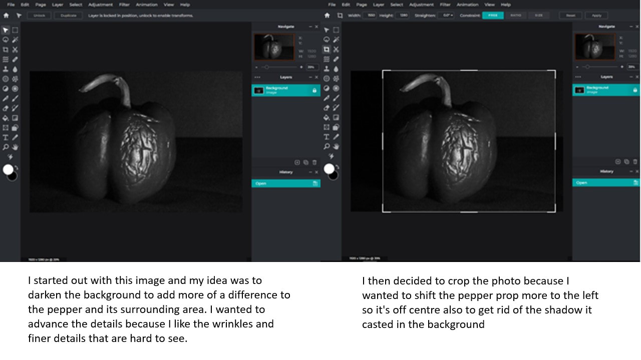
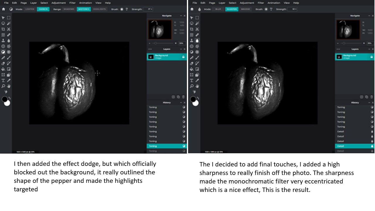
I chose this photo because I admire the way the lighting highlights the wrinkles and dents in the pepper. it makes the detail visible and pop. the strength of this photo are the choice of prop and all the texture it provided, I also think the shadows the pepper and the background produce. my editing process consisted of firstly cropping the photo down to this off centred picture which I think made the background shadow important. I then to make the background darker and more shaded, using the darken option, angling the light and assuring the focus is on the pepper. I also increased the contrast between the shadow and highlights because I wanted to add shape and figure to the picture. lastly, I sharpened the photo as my finishing touch, this really eccentricated the groves and scratches on the pepper which was my goal. I also think the camera angle used was affective since it showed the shadow at the front of the picture and the light source hitting the object at the back.
|

|
I chose this photo because of the originality of the vegetable and how its roots and shapes were dramatically outlined with the lighting and shadows. I also liked how the light brought finer features into the focus, even the shaded side has detail poking through touching the light. I decided to crop the photo so that the rule of thirds would apply making it even if you were to equally split up the picture. i think it instead of making the vegetable the focus it made the vegetables details the focus and the rest as a makeshift background. I then sharpened the photo to really bring out the small root that suck out all around the vegetable. I followed this with increasing the contrast so that there's a more moody filter to the already dark photo. my camera holding was important because it helped me captured the eye line view of the prop, the lighting placement was also a vital part of it because it helped me make this gradient between the highlights and shadows.
|

|
I chose this photo because of the obvious admirable detail to the pepper, the wrinkles added more depth to the highlights created by the lighting and it really made the picture stand out. i liked the average grooves to the shape of the pepper which i later defined. I decided to again do an off centre idea with the cropping which I think is mysterious. I wanted to completely blend the background out so that the pepper was the only thing the eyes would avert too, I did this by increasing the contrast between the shadows and highlights and then using a manual shading tool to cover the remaining background. I then sharpened the picture because I wanted the wrinkles to be in the concentrated focus of the image. I liked the eyeline level the photo was taken at and how the lighting is spotlighted onto the most detailed section, it added contrast to the photo even before the editing.
|
Abstract through Cyanotypes / Anna Atkins

|
Anna Atkins was the first person to publish a book with pictures, she was a photographer that used cyanotypes to create her iconic photos. Cyanotypes are photos taken with a specific technique, its when you use chemicals to make a negatively filtered image, usually a plant is used as the prop and since a plant has different thicknesses and textures, at some places light can pas through the object but in others it can not. where it cannot pas through the plant there is left white space an were it can there is dark details. the advantages of using this photography technique is that it captures a advanced amount of detail, since it using light as its printer, also the negative effect on the photo is admirable.
|
A disadvantage is that the process of making the image could be considered tricky and could not end up working out as well as it could, also if you desire a regular effect you cannot get it since it always prints in negative. even though the date of anna Atkins work there are still artists today that admire and use this Method of printing for example Marco Breuer, Joy Gregory and Mike Ware. The process of making a cyanotype has evolved over time making it more convenient and quick than how Anna Atkins was making her work.
Favourite Images Of Anna Atkins


My Cyanotypes

|
During our lessons making these pieces, we used different materials including regular paper, fabric and acetate negative. All pieces developed in a very similar method. our process included securing the material in place with the plant props on top, then we would let it sit in the UV light speeding up the printing of the plants shape. Overall I really approve this method of abstract photography. I personally favourite the paper method because it was easier to work with and I specifically admired the patterned solution I made and how it cut of the image and made it appear in certain placed again, I also liked the sharpness of the props that was had to emulate using the fabric due it its strength in stiffness. Also I just simple prefer the choice of plants used on the paper and their detailed shapes. If I were to have another lesson on this topic I would like to have another attempt of the acetate and using negatives piece, I liked how in the examples showed there was an advanced amount of detail also I think the limitations were more strict with other techniques, as another option although I would enjoy making a big cyanotype image so that it could hold a bigger more detailed flowers that because of the different layers and thicknesses would print more textures.
|
Abstraction Through Photograms/ Man Ray
|
Man Ray was an American painter and photographer, one of his many achievements included his ability to make photograms. photograms are a piece of art that was taken in the same sense as a photography but without a camera, only using light sensitive paper and a prop. the paper would be exposed to light and end up printing onto the paper the shape of the prop. the image was printed negatively due to its logic but it could create a very admirable piece. advantages of using photograms as a art method is that it was able to print an exact shape of the prop with the detail it staying limited, it resulted with clean pictures. a disadvantage is that the image was limited to the amount of detail that could be printed since most objects would block the sun from reaching the paper.
|
Favourite Images Of Man Ray


Process Of Making Photograms


How Is It Connected?
This technique is correlated to our abstract nature project because of the features that the photo printed with, it has a invert colour scheme that could connect to our Edward Weston theme since both had black/blue and white pictures, it also has the same elements as our researched artists like shape and emphasis. there were also similar features in how the images were set out, their focus and framing corresponded.
Horst P. Horst / The unfamiliar and abstracted


Karl Blossfeldt / Artist investigation
If I give someone a horsetail he will have no difficulty making a photographic enlargement of it - anyone can do that. But to observe it, to notice and discover its forms, is something that only a few are capable of. 
|
why this artist?
I like this artist because of the detail of his photos and how he manages to keep the images so simple yet so packed with texture and patterns. who are they? Karl Blossfeldt is a professional photographer from Germany who mainly did high key photography within his work range. He was born in 1866 and sadly died in 1932, he whilst also being a photographer was a teacher, artist and sculptor. why this quote? I chose this quote because I like how its sending a resilient message of uniqueness and individuality why this video? I chose this video because it accurately describes the revelation of Karl Blossfeldts work and it incudes his viewpoint. |
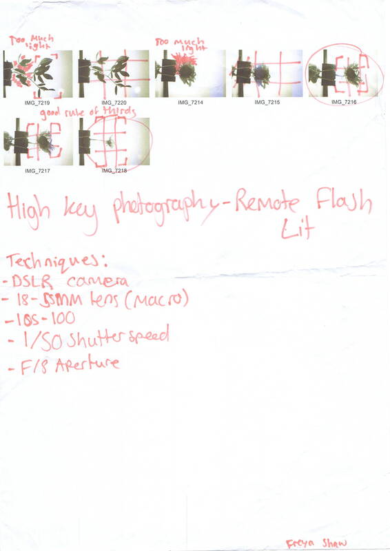
Technical Processes/ High Key

|
High key photography consists of images with a white background and little to no shadow making the bright picture as result. Its usually considered to be over exposed due to its bright photos and sometimes whitened props. The contrast within these photos are different to low key photography because instead of the mainly shadowed to little light ratio there's mainly light to little shadow, low key photography is under lit
|
whereas high key photography is over lit. High key photography can be taken in black and white as well further connecting its similarities and differences to low key photography. The overexposure in high key photography helps with making the photo contain more textures and details, to achieve this result you need a remote flash from 1/8 power, 1/50 shutter speed, f/16 aperture and a 100 ISO.


Shoot Plan / Karl Blossfeldt
|
This shoot is to be inspired by Karl Blossfeldt since during our lessons we have been learning about his abstract work. We plan to take the shoot indoors in our classroom to better controll the lighting and so that we are not affected by weather. we will use props such as plants/ natural forms and will be setting us three different shoot scenes to take the images of them

|
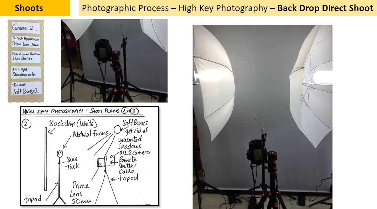

|
SEMI Analysis / Karl Blossfeldt
I feel like the message sent out by this photo is quite gloomy and lonely since the one and only prop used was placed on its own and taken pictures of in a monochromatic filter. I wish to recreate this moody atmosphere in my image by using a controlled light and shooting in a controlled environment, so my lighting comes out the same, also I will place my choice of plant in the middle of my white background keeping in mind the rule of thirds. I will very likely use the same black ad white filter since that in my opinion is the images more noticeable quality.

|
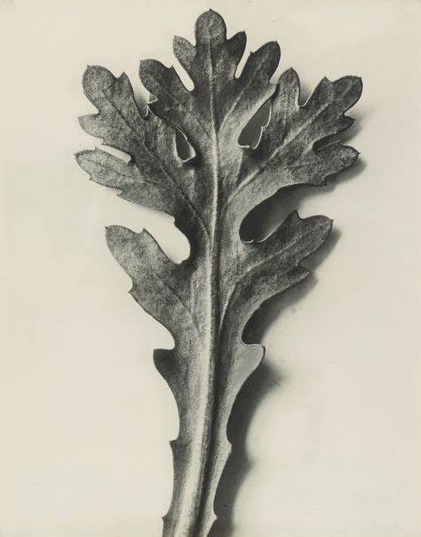
This photo was taken by Karl Blossfeldt and its named chrysanthemum segetum. it is of a left and is taken as a portraiture photo. the genre is very simple, only one leaf and a plain solid colour background and minimum shadows.
Blossfeldt used multiple of the seven elements of art and some properties from the principle of art as well, in my opinion he used a monochromatic filter in this photo well, ridding it of the colour. he also shows great shape in this and many other photos since there is only one object and its very clearly led out. whilst also being a simple picture Karl included a intense amount of detail and texture, another element of art shown, this really enhanced the pictures admirability. since the image is monochromatic the picture whilst lacking in the element of colour is making up in tone, it shows many different shades of greys in multiple areas adding slight depth to the picture. The obvious main focal point of the photo is the plant leaf since its the only object with texture in the image. it also stands out because of the colour difference between the background and the prop, if the background was anything other than white it would dim the intensity of the plant. The white background outlines the dark detailed leaf. The placing of he main focus also is important because its placed perfectly in centre using the rule of thirds, it really exaggerates the point that there's nothing else to see. the lighting I see is most likely not natural, rather a lamp positioned right Infront of the leaf. Thought there is a slight lean of a shadow of the plant so the light is leaning more left. Also the lighting really helps with highlighting the veins and waves in the leaf. I also expect that Blossfeldts shot his shoot inside which kept the setup of the background and plant so perfect. When I recreate this image I will experiment with two different shooting styles: I will shoot using my DSLR camera and macro lens from a birds eye view down at my choice of plant laying on a whit piece of paper, then I will with the same camera choice test upright with the background there and with lights on either sides(this will really limit the shadows options). both shoots will come out differently I predict but both be successful. 
|

|
|
Karl Blossfeldt / Editing Process


Final Outcome / Explosion Sketchbook


Artist Investigation / Dennis Wojtkiewicz


|
Email Quote – Direct Artist Response Why this artist?
The final artist in the Abstract Nature project is Dennis Wojtkiewicz. This artist differs from my other artists because he not only photographs in a low key manor but he then takes his images to paper and uses oil paints and acrylics to re capture them However, there are similarities in his use of low key photography linking back to Edward Weston's low key techniques, and another direction, Karl Blossfeldt and his use of high key photography within his images. Who is he? Dennis Wojtkiewicz was born 1956 and is most famously known for his hyperreal paintings firstly taken through photographs then painted as a recreation. his work consisted of him taking photographs using affective skills, then he would print them by had over to a oil painting or acrylic. |
the vibrant colours used are best capture by the media chosen and overall his attention to detail is impressive. His website is:
www.wojtkiewiczart.com
Why the quote?
The quote is from a direct email response from Dennis. W himself. From the email, I was able understand what equipment & techniques he uses such as a cannon EOS 90D and a 100mm f/2.8 macro lens. it helped me grasp a better understanding of how I will in future recreate his methods in my own work. I plan to use a contrasting colour to the fruit as a plain background
Why this video?
This video is inspirational to me because of the variety of photos and different nature props used within them, it shows really good elements and principles of photography for example; texture, line, shape, colour, contrast, symmetry and pattern. all these aspects factor in to make Dennis work as we know it, its very strongly appreciated due to then amount of detail and effort put into it.


Photographic Techniques / Back Lighting Fruit

|
Back lighting fruit is when you use a light source behind your main prop, this illuminates the prop. the lighting choice will create higher details and textures in the image and also increase the colours glow, especially if the prop is translucent. Mainly only advanced photographers use this method since it could follow with a reasonable amount of contrast adjusting yet it still created that perfectly lit up image you want.
|
In the video the woman uses a simple DIY set up with a houselights being positioned under a glass pain, which she said is best coming from a picture frame. she also used a slow shutter speed then combatted the movement that would of evolved from that with a tripod, she also had her DSLR camera on manual mode with an aperture of f8 to f12, To event the settings out she used a low ISO to retain the detail within the photos. she used a kiwi as her prop and cut it into a thin slice to allow more light to pass through, this highlighted the kiwis green colour.


|
Step 1:
Cut up your choice of fruit into a moderately thin slice so that a light can reasonably shine through. |
Step 2:
Set up you light and glass pain with your fruit placed on, this should illuminate the fruit and its colours. |
Step 3:
Change your camera settings to f8->f12 with a low ISO and slow shutter speed to get the correct settings for this shoot. |
Step 4:
Set your camera up on tripod and begin the shoot your fruit. |
Shoot Plan:
|
In this shoot I will experiment with different fruits shooting abilities using a back light shining on them, this will illuminate the fruit revealing more vibrant colours and will expose more details within the fruit. I plan to use fruits suck as grapefruits, kiwis, lemons and limes since they share a semi translucent quality. I will be taking this shoot using a DSLR camera with a macro lens. Props such as the tripod is going to be used to keep the camera at its most convenient angle, birds eye view, so that the full shape of the fruit is shown. Other props like the glass panel is being
|

|
used to hold up the fruit slice but still allow the light to travel through, reaching the fruit. I will also be using a remote flash to prevent shakes through the camera during my shoot, this will achieve the crisp results I aim for.
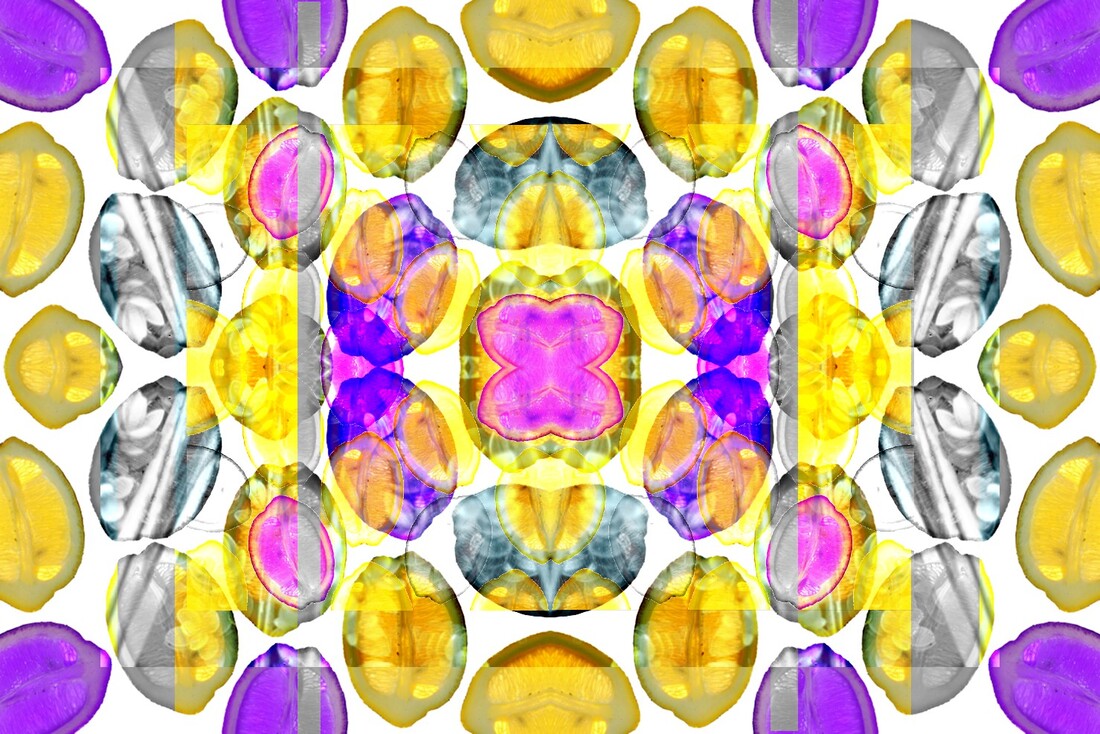
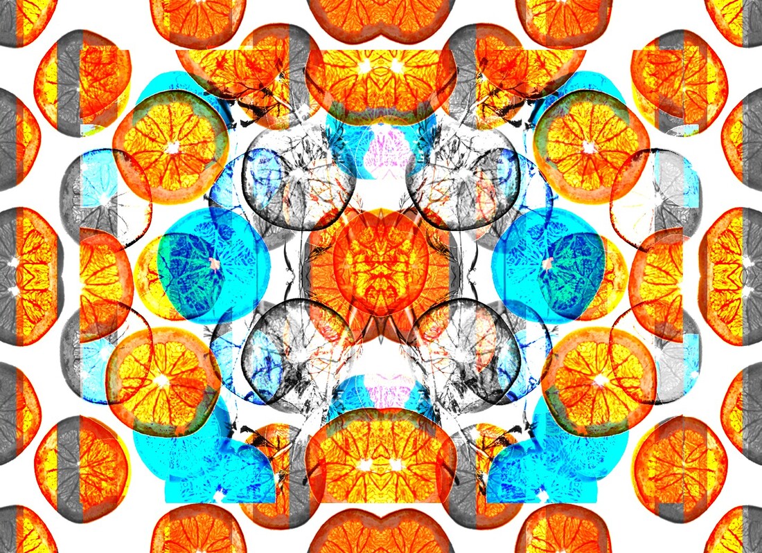
Dennis Wojtkiewicz / Contact Sheet

Post Editing / Dennis Wojtkiewicz

My first step was to edit the picture of the fruit, I altered the contrast and saturations of this image making the colour more vibrant and have a cooler tone to them.

I copied the fruit image multiple times on multiple layers creating this affect, I filled up the room on the page with different angled kiwis.
|

I then used the lasso tool to outline the fruit, I then cut it out and placed it on a blank background ready to be copied and collaged around.

I then picked out certain kiwi fruit to be changed to monotone and some to be changed to a different hue, I picked a blue hue to correspond with the cool tone mood.
|


Abstract Nature / Hand Manipulation Sample Boards.

Abstract Nature Art Evaluation:
Throughout this project I have explored different styles of abstract nature and the effect they have on photography. I have focused on nature during this time as my theme and used different props with different shoots, I have used fruits, vegetables, leaves, flowers deceased and alive, plants of different kinds, shells and corals. I have experimented with different camera settings and different set ups with a variety of light angles. I have researched and emulated multiple artists work all on the theme of abstract nature.
Javiera Estrada:
Initially, I researched Javeria Estrada and her work during my summer project, this started the abstract nature theme and connects due to her methods in creating images. She used a water surrounding and used inks and flowers, she sets up the flowers in an organised order under the water then used different inks to create a cloud of colour around the plants. Her work shows powerful principles of photography as well as elements, these include colour , texture and emphasis. Whilst attempting this project I used the scenery of a bath filled with water to reimburse the tank used in Estrada's work, I then continued with coloured ink and flowers that I placed in I then timed the photos correctly to really capture the ink in motion/action. I angled my camera from a birds eye view to fit in all the featuring properties within the shoot.
Initially, I researched Javeria Estrada and her work during my summer project, this started the abstract nature theme and connects due to her methods in creating images. She used a water surrounding and used inks and flowers, she sets up the flowers in an organised order under the water then used different inks to create a cloud of colour around the plants. Her work shows powerful principles of photography as well as elements, these include colour , texture and emphasis. Whilst attempting this project I used the scenery of a bath filled with water to reimburse the tank used in Estrada's work, I then continued with coloured ink and flowers that I placed in I then timed the photos correctly to really capture the ink in motion/action. I angled my camera from a birds eye view to fit in all the featuring properties within the shoot.
Edward Weston:
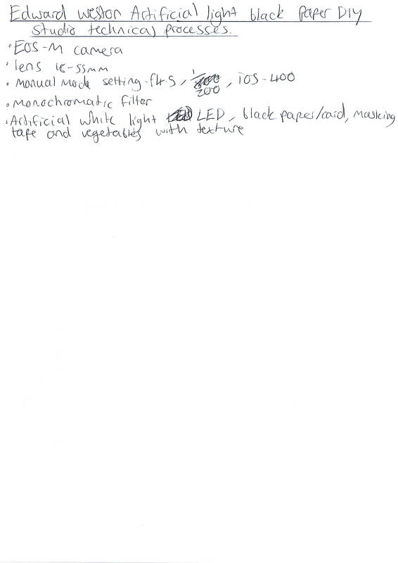
During this project I researched into Edward Weston and his work, I particularly admire that within his work he includes deep contrasts between the black and white theme and I took notice of his choice of vegetables and their individual properties suck as the famous green pepper that was grown deformed. An example of Edward Weston's talent can be shown in how he defined the curves of the fruit using his strong shadows and highlights. Looking at his work he shows great shape and texture of the vegetables, the contrast and form convey a moody atmosphere. Through studying this artist, I was able to explore in actions the elements of photography that he used in my own work. I shot using a set up of a black A3 paper set up as a corner of a box with a vegetable and a bright light shining from the front view. I did a second shoot experimenting with a vegetable placed in a plant pot, this surrounded the prop with a black background. I took the photos using my EOS-M camera and 18-55mm lens and used the camera settings f4.5 and a ISO of 400
During this project I researched into Edward Weston and his work, I particularly admire that within his work he includes deep contrasts between the black and white theme and I took notice of his choice of vegetables and their individual properties suck as the famous green pepper that was grown deformed. An example of Edward Weston's talent can be shown in how he defined the curves of the fruit using his strong shadows and highlights. Looking at his work he shows great shape and texture of the vegetables, the contrast and form convey a moody atmosphere. Through studying this artist, I was able to explore in actions the elements of photography that he used in my own work. I shot using a set up of a black A3 paper set up as a corner of a box with a vegetable and a bright light shining from the front view. I did a second shoot experimenting with a vegetable placed in a plant pot, this surrounded the prop with a black background. I took the photos using my EOS-M camera and 18-55mm lens and used the camera settings f4.5 and a ISO of 400
Anna Atkins:
Throughout the time of this project I did research into anna Atkins and her cyanotypes. I admired her choice of subject in her images, their variety of different thicknesses and textures showed through in the printing and made a admirable picture. The cyanotype is printed in an inverted type filter and paired with anna Atkins work goes very nicely. The process of making a cyanotype includes specific chemicals and a mixture of processes, annas option of using flowers and leaves make the details on them become more defined. Her work explores factors like shape and texture with properties of form, these all work well together in an image. I attempted with annas work process and emulated my own ideas, I investigated the processes of making a cyanotypes and used props such as flattened and dead flowers and plants. We used chemicals that reacted with the sun and places the prop on it and left it to leave a print, once left for the effective amount of time I took my prints and briefly flushed them with water activating the chemicals. This work connects to the theme of abstract nature with the shown imagery of nature in an obscure state.
Throughout the time of this project I did research into anna Atkins and her cyanotypes. I admired her choice of subject in her images, their variety of different thicknesses and textures showed through in the printing and made a admirable picture. The cyanotype is printed in an inverted type filter and paired with anna Atkins work goes very nicely. The process of making a cyanotype includes specific chemicals and a mixture of processes, annas option of using flowers and leaves make the details on them become more defined. Her work explores factors like shape and texture with properties of form, these all work well together in an image. I attempted with annas work process and emulated my own ideas, I investigated the processes of making a cyanotypes and used props such as flattened and dead flowers and plants. We used chemicals that reacted with the sun and places the prop on it and left it to leave a print, once left for the effective amount of time I took my prints and briefly flushed them with water activating the chemicals. This work connects to the theme of abstract nature with the shown imagery of nature in an obscure state.
Man Ray:
I researched into man rays work and discovered his use of photograms, he has elements such as contrasts space and shape in his black and white coloured pieces. The process of making photograms is similar to cyanotypes it involves a object being placed on light sensitive paper, their usual semi translucent material prints detail onto the page creating a picture in a invented filter. The angle of the print makes it be perceived as a birds eye view image thus portraying the abstract method. The effect the photogram had on the colour also shows abstract qualities, the abnormal hues in the photograph that the subjects would naturally not have is original.
I researched into man rays work and discovered his use of photograms, he has elements such as contrasts space and shape in his black and white coloured pieces. The process of making photograms is similar to cyanotypes it involves a object being placed on light sensitive paper, their usual semi translucent material prints detail onto the page creating a picture in a invented filter. The angle of the print makes it be perceived as a birds eye view image thus portraying the abstract method. The effect the photogram had on the colour also shows abstract qualities, the abnormal hues in the photograph that the subjects would naturally not have is original.
Horst P Horst:
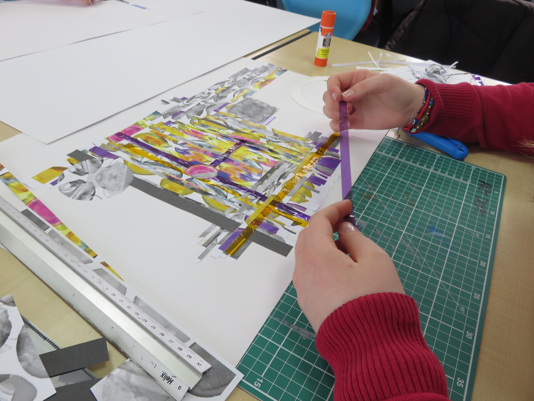
During this project I looked into fashion photographer Horst P Horst and discovered his style of work with the use of rotational symmetry. I correlated his work to abstract nature by using my Edward Weston images and cyanotypes, after editing them to create the four time rotated and reflected photos they produced some very original and exceptional collection. Horst P Horst shows multiple principles and elements of photography, this includes pattern and shape with qualities on a select few like tone and texture. In my own work I used a site called pixelr e to emulate the rotational symmetry in horsts work, I had the photos ready from Edward Weston already taken and edited and the cyanotypes needed no editing. His work experimented with abstract nature with his rotation and use of props such as leaves, his colour theme added a individual trait to his art.
During this project I looked into fashion photographer Horst P Horst and discovered his style of work with the use of rotational symmetry. I correlated his work to abstract nature by using my Edward Weston images and cyanotypes, after editing them to create the four time rotated and reflected photos they produced some very original and exceptional collection. Horst P Horst shows multiple principles and elements of photography, this includes pattern and shape with qualities on a select few like tone and texture. In my own work I used a site called pixelr e to emulate the rotational symmetry in horsts work, I had the photos ready from Edward Weston already taken and edited and the cyanotypes needed no editing. His work experimented with abstract nature with his rotation and use of props such as leaves, his colour theme added a individual trait to his art.
Karl Blossfeldt:
For a project I researched into Karl Blossfeld's work with high key photography and his methods in his shoots. His images consist of nature pieces being photo'd paired with a white background, a light would usually be aimed directly In front of the prop to illuminate and reveal the smallest of details located on the leaves/flowers exedra. Through the study of this artist I have found that in his work he shows strong principles and elements of photography such as tone, texture balance and space. The focus of these images are usually found in the decided centre making the images as symmetrical as possible. When recreating Karl's work I used my EOS camera and my 18-55mm lens I used setting such as 1/50 shutter speed and f/16 aperture and a 100 ISO. These all affected the result but together made the images the overexposed aim I was looking for. Karl's work can be considered abstract nature due to the forms used being objects such as flowers and plants being placed in a unnatural environment, the blank background.
For a project I researched into Karl Blossfeld's work with high key photography and his methods in his shoots. His images consist of nature pieces being photo'd paired with a white background, a light would usually be aimed directly In front of the prop to illuminate and reveal the smallest of details located on the leaves/flowers exedra. Through the study of this artist I have found that in his work he shows strong principles and elements of photography such as tone, texture balance and space. The focus of these images are usually found in the decided centre making the images as symmetrical as possible. When recreating Karl's work I used my EOS camera and my 18-55mm lens I used setting such as 1/50 shutter speed and f/16 aperture and a 100 ISO. These all affected the result but together made the images the overexposed aim I was looking for. Karl's work can be considered abstract nature due to the forms used being objects such as flowers and plants being placed in a unnatural environment, the blank background.
Dennis Wojtkiewicz:
When experimenting in this project I was looking into Dennis Wojtkiewicz's work and how he used backlighting to illuminate pieces of fruit, I admired his creativity and processes in his work. When recreating his photos I used a transparent table and a thinly sliced fruit and shot images using a back light under the fruit to highlight it. I used a slow shutter speed paired with a aperture of f/8 and 200 ISO, this gave the detail needed to not over expose the photo to a blur. Dennis' work included ideas such as shape, contrast, colour and balance. All the elements experimented with fitted his work into the abstract nature group, the symmetry within his photos and the advanced colour and detail made an improvement. His work helped me understand the theme of abstract nature and helped me experiment with different lit fruits at different thicknesses and sizes.
When experimenting in this project I was looking into Dennis Wojtkiewicz's work and how he used backlighting to illuminate pieces of fruit, I admired his creativity and processes in his work. When recreating his photos I used a transparent table and a thinly sliced fruit and shot images using a back light under the fruit to highlight it. I used a slow shutter speed paired with a aperture of f/8 and 200 ISO, this gave the detail needed to not over expose the photo to a blur. Dennis' work included ideas such as shape, contrast, colour and balance. All the elements experimented with fitted his work into the abstract nature group, the symmetry within his photos and the advanced colour and detail made an improvement. His work helped me understand the theme of abstract nature and helped me experiment with different lit fruits at different thicknesses and sizes.
Successful Outcomes:
I would say that during the abstract nature project in total my strongest work would be my rotational symmetry withy my cyanotypes and my Edward Weston photos, I also enjoyed and favourited my Dennis Wojtkiewicz work and my final edits I completed with pixelr e's editing options. With my Dennis emulated work I liked the filling of space the editing of my fruit gave, the colours I experimented and resulted with added a dynamic effect. With my rotational images I likes the symmetry and equal parts they supplied, they had great contrast between each part and contained advanced detail. The setting when doing my Weston shoot paid off and created some well detailed images which included a variety of different plants and objects. I believe that after all my editing the properties of the images noticeable enhanced ( primarily the colour of the fruits and their shoot). Looking at a creative point I think the idea of adding lines of monochrome filtered striped added contrast and more subject to my final edits. I think that my research for firstly Dennis Wojtkiewicz and Karl Blossfeldt gave me a large amount of understanding of my plan so I completed them with success.
I would say that during the abstract nature project in total my strongest work would be my rotational symmetry withy my cyanotypes and my Edward Weston photos, I also enjoyed and favourited my Dennis Wojtkiewicz work and my final edits I completed with pixelr e's editing options. With my Dennis emulated work I liked the filling of space the editing of my fruit gave, the colours I experimented and resulted with added a dynamic effect. With my rotational images I likes the symmetry and equal parts they supplied, they had great contrast between each part and contained advanced detail. The setting when doing my Weston shoot paid off and created some well detailed images which included a variety of different plants and objects. I believe that after all my editing the properties of the images noticeable enhanced ( primarily the colour of the fruits and their shoot). Looking at a creative point I think the idea of adding lines of monochrome filtered striped added contrast and more subject to my final edits. I think that my research for firstly Dennis Wojtkiewicz and Karl Blossfeldt gave me a large amount of understanding of my plan so I completed them with success.
Areas Of Improvement:
I would state that during my work I had trouble finding the correct setting on my camera to correctly gain the best from each shoot , I do believe that will time my understanding improved but it still has room for more. I also would argue that with my artist researches I could of done a deeper dive into their processes and their method on how to take the ideal wanted pictures. I would also say that I had experienced trouble throughout this project with getting the correct and most detail defining light that pairs with my camera settings, it would be common that it could turn out either under exposed or over exposed. Editing did fix this dilemma but less editing could have been done if I had grasped knowledge of how to harmonize the camera settings and light.
I would state that during my work I had trouble finding the correct setting on my camera to correctly gain the best from each shoot , I do believe that will time my understanding improved but it still has room for more. I also would argue that with my artist researches I could of done a deeper dive into their processes and their method on how to take the ideal wanted pictures. I would also say that I had experienced trouble throughout this project with getting the correct and most detail defining light that pairs with my camera settings, it would be common that it could turn out either under exposed or over exposed. Editing did fix this dilemma but less editing could have been done if I had grasped knowledge of how to harmonize the camera settings and light.
